The Top 5 Wayfinding Design Principles in Healthcare
Adhering to wayfinding design principles is becoming more and more vital to healthcare facilities. In a recent issue of Medical Construction & Design, Ari Grazi explains how wayfinding can combat negativity and even prescribe positivity through the hallways.
The average patient encounters several sensory experiences when they visit a hospital or medical facility. They hear beeping machines, smell sanitizer, and look around to find the right department for their treatment. These experiences can quickly overwhelm patients and their families – especially when they visit major hospitals.
The right hospital signage and wayfinding can make the medical experience less stressful, resulting in happier patients.
If you are looking to improve patient experience, here are five wayfinding design principles in healthcare to embrace.
1. Consider the Headspace of Hospital Patients
Stressed patients are unable to think clearly and focus on directions to find their way. Parents and family members are often overwhelmed with concern, while patients who are sick or in pain can’t focus on complex signage. Hospital wayfinding elements need to be clear and readily available to help both patients and visitors.
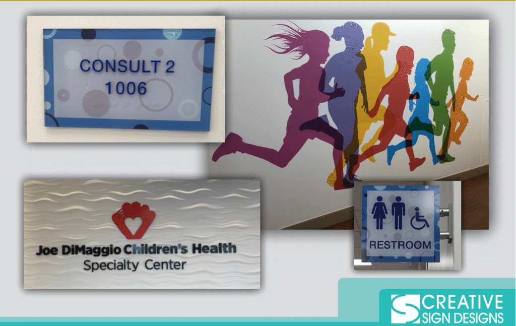
Joe DiMaggio’s Children’s Health Specialty Center in Wellington, Florida is a 30,000 square foot facility that helps kids of all ages and needs. Parents oftentimes have a hard time bringing kids to hospitals – even for routine check-ups or vaccinations. This is why the health center turned to Creative Sign Designs to help create a more engaging environment.
We used bright colors and cool graphics to make the signage more fun, helping kids feel safe and relax. Providing clear signage also helped parents better navigate their way around the hallways, reducing their stress as they sought treatment for their kids. These small details add up and create positive experiences.
Your wayfinding has the power to lower stress levels while helping overwhelmed visitors. You can remove hospital navigation from the stressors of the people you want to help.
2. Use Symbols and Images to Guide Visitors
As you develop your wayfinding materials, consider how you plan to present instructions to visitors. Adding images to your signage and using symbols can help convey information and guide people through your halls.
On average, images are processed up to 600 times faster than words. Someone can recognize a ladies’ room sign faster than they can read the word “restroom.” While the difference between reading words and seeing an image is in milliseconds, this time can make a difference as people navigate your hospital.
You can see examples of symbols in wayfinding through our designs for Baptist Health of Jacksonville. The logo is featured prominently on the parking garage so patients can easily know where they are going. The other wayfinding signage includes icons to guide visitors even before they read the wording. Our work follows the top wayfinding design principles in healthcare.
Tapping into symbols for your wayfinding can also make the experience more accessible. Visitors who can’t read or speak English can still navigate through the hospital without having to stop your staff members or find someone to help them. This makes the process less intimidating (and therefore more welcoming) for patients of all backgrounds.
3. Use Prominent Signage to Direct Visitors to Common Areas
Today’s hospitals are equipped with visitor support staff members who work to guide people throughout the day. Their job is to answer patient questions and make sure they are headed in the right direction. You don’t want visitors wandering into surgical wards or doctors stopping every few feet to give directions.
To help visitors find where they need to go, direct them to major common areas like the atrium or food service area. Make visitor information desks clearly visible. This will help people seek out help instead of striking out on their own.
Look at the directories we created for St. Vincent’s HealthCare. The maps are simple and color-coded to guide visitors through the multi-level healthcare facility. The goal of the signage created without is to bring people to common areas so they can figure out which offices or patient rooms they need to find.
4. Consider How to Offer Wayfinding While Social Distancing
The COVID-19 pandemic has changed how visitors see hospitals. Many patients are worried about encountering sick patients and potentially falling ill themselves, even if they aren’t anywhere near the Covid ward. Wayfinding is a particularly important part of the patient experience during the pandemic, as it helps people find the right wings and makes them feel safe when they are there.
Even before the pandemic, we took wayfinding very seriously when we designed the signs for the 839-bed Sarasota Memorial Hospital. Our team created signage that guided visitors through the parking lot, to the right floor, and even to the correct room. This makes it easier for the 5,000 staff members (including 600 volunteers) to create positive patient experiences.
Today’s signage doesn’t just include wayfinding, it also includes waiting room guidelines that tell people where to sit so they are socially distant, along with other health guidelines like mask-wearing and using hand sanitizer.
5. Incorporate Your Branding
Branding is one of the key wayfinding design principles in healthcare. Patients want to know that they are getting treatment at the best hospital in their area. They want to know that they can trust the doctors and other staff members inside.
The University of South Florida has some of the best research universities in the country and provides top-notch treatment to residents. This is why we made sure the logos were presented clearly when we created signage for the USF Health Morsani College of Medicine and Heart Institute. This healthcare group is impressive, and our environmental branding and signage help highlight their brand and accolades.
Follow Wayfinding Design Principles in Healthcare To Reduce Patient Stress
By taking advantage of key wayfinding design principles, hospital managers and operations teams can create better experiences for patients during stressful times in their life.
From a first-time father bringing his wife to the delivery ward to a cancer patient who only needs one more treatment to beat the disease, positive wayfinding design principles in healthcare can help visitors focus on getting better and reduce the stress of navigating large and oftentimes confusing hospital wings.
If you are looking to improve your hospital signage and wayfinding, let’s talk. Creative Sign Designs has vast experience working with hospitals to construct full-scale signage plans. Contact us today to see how we can bring your project to life.


