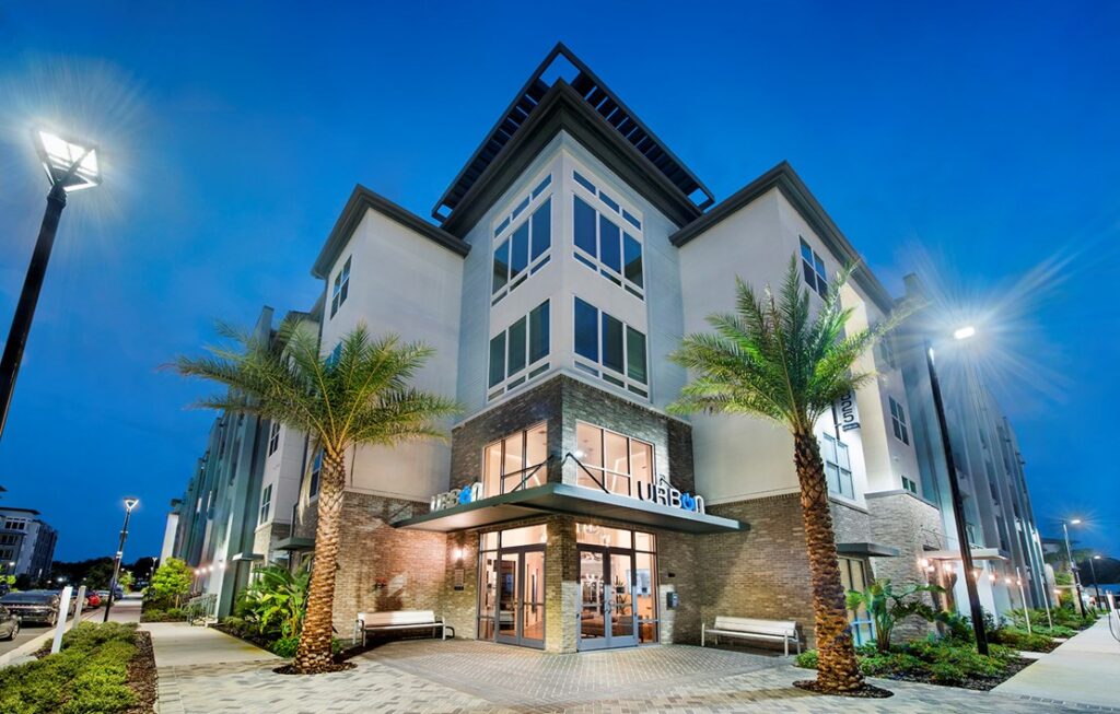
Mixed-Use & Multifamily Wayfinding and Signage Trends
Today’s apartment complexes, condo associations, and other multifamily or mixed-use campuses don’t just sell homes and units – they sell lifestyles. From the initial monument signage at the main entrance to the landscaping and wayfinding throughout, you tell potential residents and guests what it’s like to live there. You can paint a picture of luxury, community, or peace.
However, creating this welcoming experience takes work and a careful eye on your branding. A lack of wayfinding – or poorly created signs – can send the wrong message and discount your marketing efforts to local families.
If you want to put your best foot forward and draw people to your mixed-use space, evaluate your current signage options and create a plan to update your existing designs.
Improve the Resident Experience With Environmental Branding
As you develop a plan to improve your wayfinding and other signage elements, keep the concept of environmental branding in mind. This refers to the design features (like signage and landscaping) that contribute to the overall brand. Essentially, these elements prove that you are “living your brand values,” rather than saying what your brand stands for and then showing residents otherwise.
Consider the designs our team did for Sparkman Wharf, a mixed-use community area in Tampa Bay. The main sign was created with eight perforated aluminum panels and custom LED neon tubes. Each restaurant in the area has its own signage that matches its brand, while still keeping with the overall feel of the Wharf. Grabbing a bite to eat in this area isn’t just a visit to a mixed-use facility, it is an experience that keeps people hanging out for much longer than they otherwise would.
Related: Environmental Branding: Using Your Commercial Property to Tell a Story
Get Creative With Faux Finishes
One of the biggest concerns of private companies looking to update their branding is the cost. They want signage that blends in with the environment and contributes to the overall experience but can’t afford the cost. Furthermore, some of the materials they would love to use – like stone, driftwood, or marble – are too heavy or too delicate to serve as standardized signage. This is where faux finishes come in.
The use of faux finishes is one of the hottest trends of 2021. These finishes use paints and look-alike materials to make a sign look like it is made of bricks or bronze, without the cost that comes with it.
Faux finishes can be applied to both interior and exterior signage, allowing you to update your designs without going over budget.
Look Into Sustainable Products
Another benefit of using faux finishes in your signage is that you can opt for more sustainable products – helping the environment while assuring your residents and customers that you care about the materials that you use.
We are constantly exploring different materials to see how easy they are to work with and how they can reduce our clients’ impact on the environment. In our designs for Volaris of Starkey Ranch in Odessa, Florida, we used a Cali Bamboo composite material that was applied as a background to the main signage. Not only was this more affordable and environmentally-friendly, but the material is more durable than actual wood, while still looking like wood.
Opting for a more sustainable option might be the same cost or less than the traditional materials you want to use, and there are several benefits to choosing them.
Be Strategic with LED Lighting
Lighting plays a major role in your signage, from the colorful bulbs that attract drivers to your campus to parking lot lights that make people feel safe at night. However, good lighting doesn’t have to be expensive or delicate.
For almost all of our signage projects, we recommend using LED lights. Their initial investment might cost more, but you will have to buy fewer bulbs to light the same space. Plus, these bulbs last 50x longer than your average incandescent light and can help you reduce your energy consumption by 70 percent.
The savings you can experience with your LED bulbs can really let you get creative with signage. Consider backlighting, uplighting, and wayfinding lights so your campus stands out at night.
Streamline Your ADA Signage
If you want your multifamily unit to be truly inclusive, then it’s time to evaluate your wayfinding signage and other designs to make sure they meet ADA standards. The Americans with Disabilities Act is meant to protect the 61 million people in the United States who have disabilities. To be ADA compliant, businesses and residences need to have features like guard rails, ramps, and emergency systems that accommodate those who are blind or deaf. For example, a fire alarm can be heard by someone who is blind, while a bright flashing light can be seen by someone who is deaf.
Consider how your wayfinding and signage would be viewed by someone with a disability:
- Are your ramps, elevators, and other accommodations clearly labeled on maps?
- Do you have signs guiding residents and guests to these features?
- Do your signs incorporate braille and are they high enough for a blind person to get to?
- Are the doors in your common areas clearly marked with signs at the entrances stating what is inside?
Use an ADA checklist to make sure your signage and facilities are up to date – you may even want to hire a professional to objectively audit your mixed-use campus for you.
Work With an Expert Team to Coordinate Your Signage Rollout
As you explore all of the different materials, signage types, finishes, and needs for your multifamily community, you may get overwhelmed by the work ahead of you. Don’t fret. Instead, work with a professional who can map out the entire project and make sure every detail is addressed.
At Creative Sign Designs, we have worked on large hospital campuses (spanning several buildings) and basic parking lots. We can make sure your mixed-use complex has the right lighting and wayfinding to guide residents and make them proud to call your neighborhood home. Reach out today for help with your next project.

