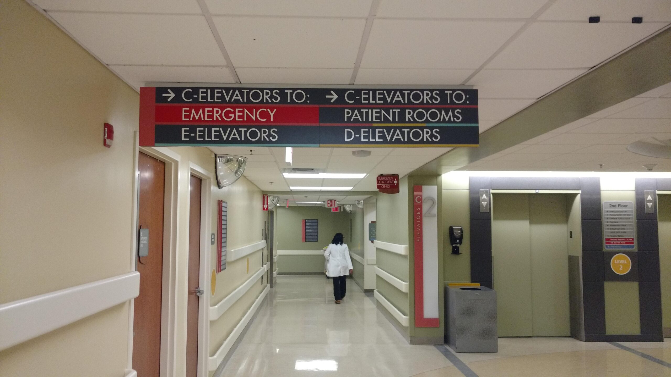
A Wayfinding Evolution in Healthcare
First, there was nature. Reading water, a crescent moon, tree growth patterns, and bird migrations, constellations that point to the North Star. Then, there was signage. ‘You are here.’ ‘Go this way to get to your destination.’ ‘This is the name of this business and these are the goods and services they provide.’ Next, digital signage. Interactive kiosks. Mobile accessibility. Real-time updates and customization. Time-sensitive emergency messaging. So, that’s it, right? From natural to analog to digital, the evolution of signage and wayfinding is now complete, right? Well, not quite so fast.
We Are Here: The Current State Of Healthcare Wayfinding
Before we seem too hasty to move on to the Next Big Thing, digital signage is still the most accessible, functional wayfinding delivery method as it allows the delivery of real-time messaging to your target audience. Its capabilities, when entirely and properly applied, serve as an excellent outlet for information.
After all, hospitals and healthcare facilities face incredibly unique challenges – and opportunities – when it comes to signage. And one of the most difficult challenges of healthcare wayfinding design is imagining how new visitors to a health care facility will respond and interpret your signage. And with many hospitals and healthcare facilities expanding and reorganizing due to mergers, integrations, construction, complex functions and departments, and strategy changes, navigation proves even more challenging for patients – and even employees – finding their way down new corridors, multiple levels, hallways, elevators, and hundreds of rooms.
As such, signage is particularly critical due to the nature of the population: Patients who are ill or injured, under stress, and generally unfamiliar with hospitals or clinics are at a disadvantage when trying to find their way, as are the visitors who come to see them. So clear and concise exterior and interior wayfinding signage provides crucial navigation, and color-coded, highly visible and strategically placed directional and identification signage can greatly reduce travel time and confusion when time is of the essence. But now, it doesn’t end there.
Next Stop: The Evolution of Healthcare Wayfinding
Consider the case for Mercy Health launching ‘Right this Way,’ an in-hospital wayfinding app that will improve the patient experience by making it easier to navigate the campus. As the hospital’s president and CEO explains, “‘Right This Way’ makes it easy for patients and visitors to find their way around the hospital. It offers detail-rich indoor maps, turn-by-turn indoor navigation, parking help and more on cell phones, kiosks and on Mercy Health’s website.” Additionally, it can guide users to the department or room they want to visit, remind users where they parked, help reduce missed or late appointments, all while leveraging turn-by-turn indoor navigation within one to two meters.
The Future of Wayfinding Is Now
To say we get a little excited about signage is, admittedly, an understatement. And with so many iterations, evolutions and options, it seems the sky’s the limit for how it can improve the quality of life for those it serves. So if you’re thinking of integrating more effective – and evolutionary – wayfinding in your hospital, contact us today!


