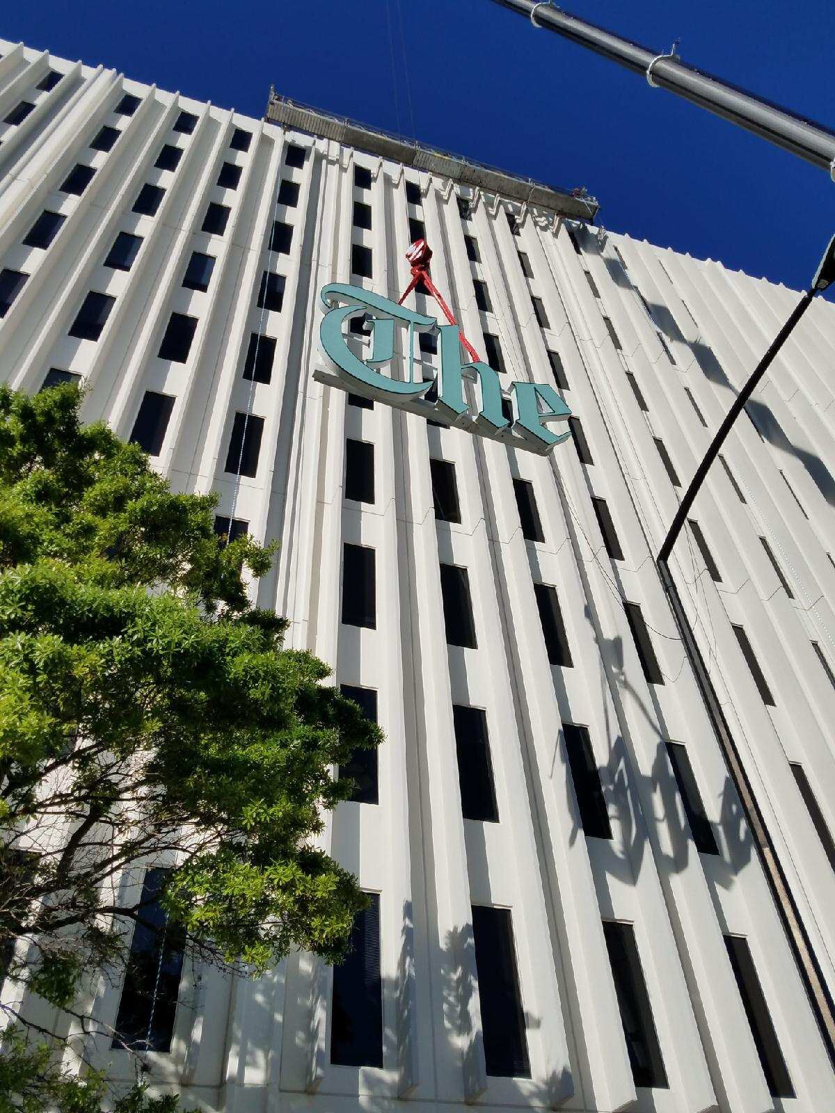
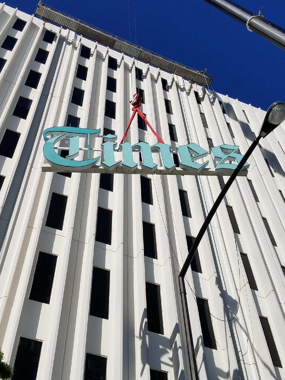
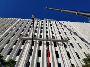
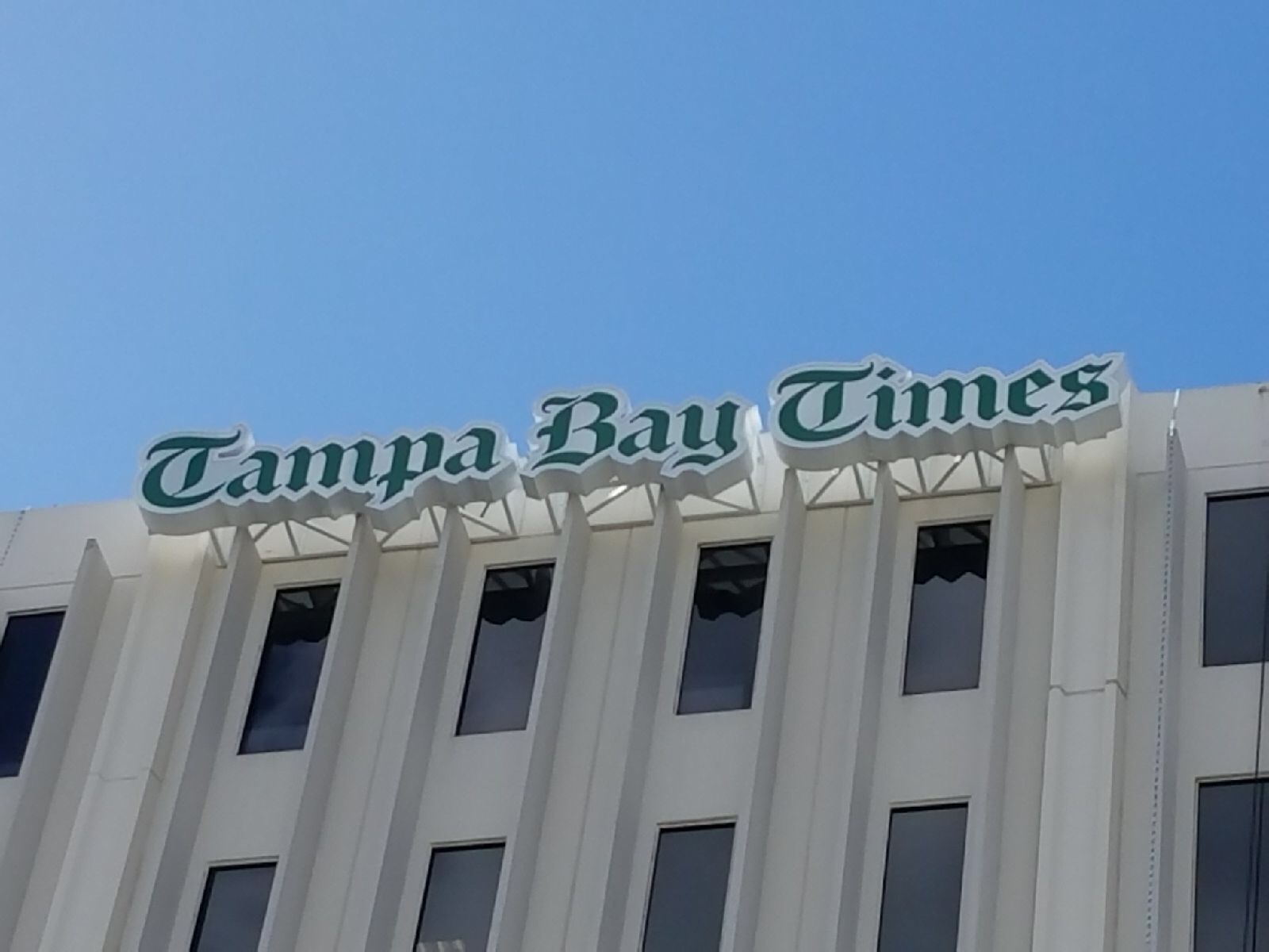
“The Times, they are a changing”! That phrase rang true when the Creative Sign Designs Team was tasked with replacing the iconic Old English lettering that had adorned the top of one of Tampa’s oldest news institutions. “The Times” message, once an integral part of the downtown skyline, had to give way to the new “TAMPA BAY TIMES” script, ushering in a new era that reflected the forward-thinking news agency. Creative worked hand-in-hand with city planners and zoning officials in order to achieve approval on size, square footage as well as placement!
Tampa Bay Times
Client: Tampa Bay Times
Location: Tampa, FL
Industry: Corporate Office
Signage Solution: Exterior Signage
The Times announced the purchase of the Tribune headquarters in downtown Tampa in May of 2016. The purchase marked the end of the 123-year-old Tampa Tribune as a stand-alone daily newspaper. The Times began its history about 134 years ago as the West Hillsborough Times out of Dunedin. It was known for most of its existence as the St. Petersburg Times, but changed its name to the Tampa Bay Times in 2016 to reflect the home territory it serves in Pinellas, Hillsborough, Pasco and Hernando counties.
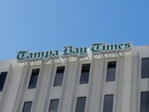
The building currently has 3 signs installed. The signs currently say “The Times”. Current codes would not allow for the same building placement due to the lettering extending above the roof line. With that being said, the height of the new letters would have to be decreased slightly to fit the specifications. Creative Sign Designs was tasked with updating the lettering to their current branding “Tampa Bay Times”. The new “Tampa Bay Times” message was custom manufactured in a contour style with allowed for a better contrast between the corporate green color and the many vertical and horizontal architectural features of the News Headquarters. The new image features innovative LED technology with self-enclosed power supplies, making the “TAMPA BAY TIMES” message inexpensive to operate and mainly maintenance free. Additional safety features were also built into the display including heavy gauge aluminum sides and backs and fabricated aluminum retainers to secure the image faces to the sides of the lettering.
The signs are located on the north side which fronts W Fortune St, the east which fronts Ashley Dr. and the south which fronts Tyler St. Creative will be removing all existing signage including the existing mounting assemblies. All three signs will be the same size and will be located on the same elevations as the original signs. The new letters are almost 4 ½’ tall and span almost 32’ wide. There are three separate contoured cabinets per side that are 12” deep. The face of the cabinets translucent polycarbonate with green translucent vinyl decoration. Illumination is accomplished by using high output energy efficient white LED lighting. Special steel bracketing and mounting frames needed to be constructed to carry the weight of the new image. The client also insisted on a cleaner, more readable look both during the day as well as evening hours.
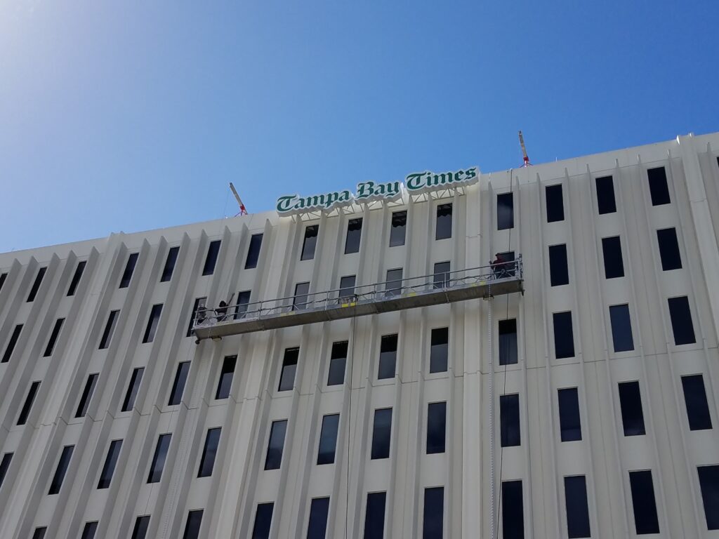
Lastly, cranes capable of reaching the top of the 131′ building were needed as well as strict coordination of installation as the removal and placement of the new display could not hinder the traffic patterns of the Straz Center for the Performing Arts during special events and concerts in its peak season.
The installation has already begun with the North and East elevations already in place leaving the last South elevation set to be placed over the upcoming days. Brighter things are happening downtown and Creative is happy to be part of the change.
- Exterior Signage
- Channel Letters

Looking For a Consultant For Your Next Project?
Get in touch with our team today to get started.
